Close up of lock on iron box at rear entrance Cathedral de Sevilla, Spain approx f3.5.
First of all to be very clear, this is not a lens for inexperienced photographers, it's not easy to use well and being fully manual you need to know how to perfectly set your exposure, adjust rendering options, determine exactly where to focus and then nail that focus perfectly. Furthermore you need to choose your gunfights carefully, there are far more images it is in no way suited to than those it truly excels at.
Finally unless you are prepared to shoot RAW and use a raw convertor then post editing options creatively it's unlikely you will achieve results that look ideal, in fact your photos may end up looking simply bland and out of focus.
It goes without saying then that all the images you see in this article were shot in RAW and appropriately post edited, which is the way I always test a lens, I'm more interested in a lenses' potential rather than out of the box results.
M4/3 Only
Yes, yes, I know it comes with mount options for APSC mirrorless cameras, and yes you could mount it on a Sony A7 series but lets be frank, this lens is designed to cover a much smaller format than even M4/3, all you are going to get if you use it on anything bigger than M43 is a lot of useless wasted pixels. M4/3 is where it’s at, of course you could use a larger format and crop the middle out, if that’s what you desire or you don’t have an M43 camera go ahead, I won’t argue, but for this article please accept that everything I am saying is on the basis of shooting the lens on an M43 platform.
The lens will cover the M4/3 image area at moderate apertures with a little bit of vignetting, nothing too dramatic mind and easily sorted in post editing if you wish, normally I don’t wish, in fact I usually add more vignetting to taste, and many of the images in the article were treated that way.
The lens will never resolve truly sharply across the whole frame regardless of aperture, but it gets very very close at the minimum aperture (more on that later), you could never consider this as a small replacement for regular M4/3 lens, I know most folk reading this with be well aware of that but I mention it just in case you have no prior knowledge of the little blighter.

Detail of plaster work, Alcazar Palace, Seville, Spain, approx f4.5
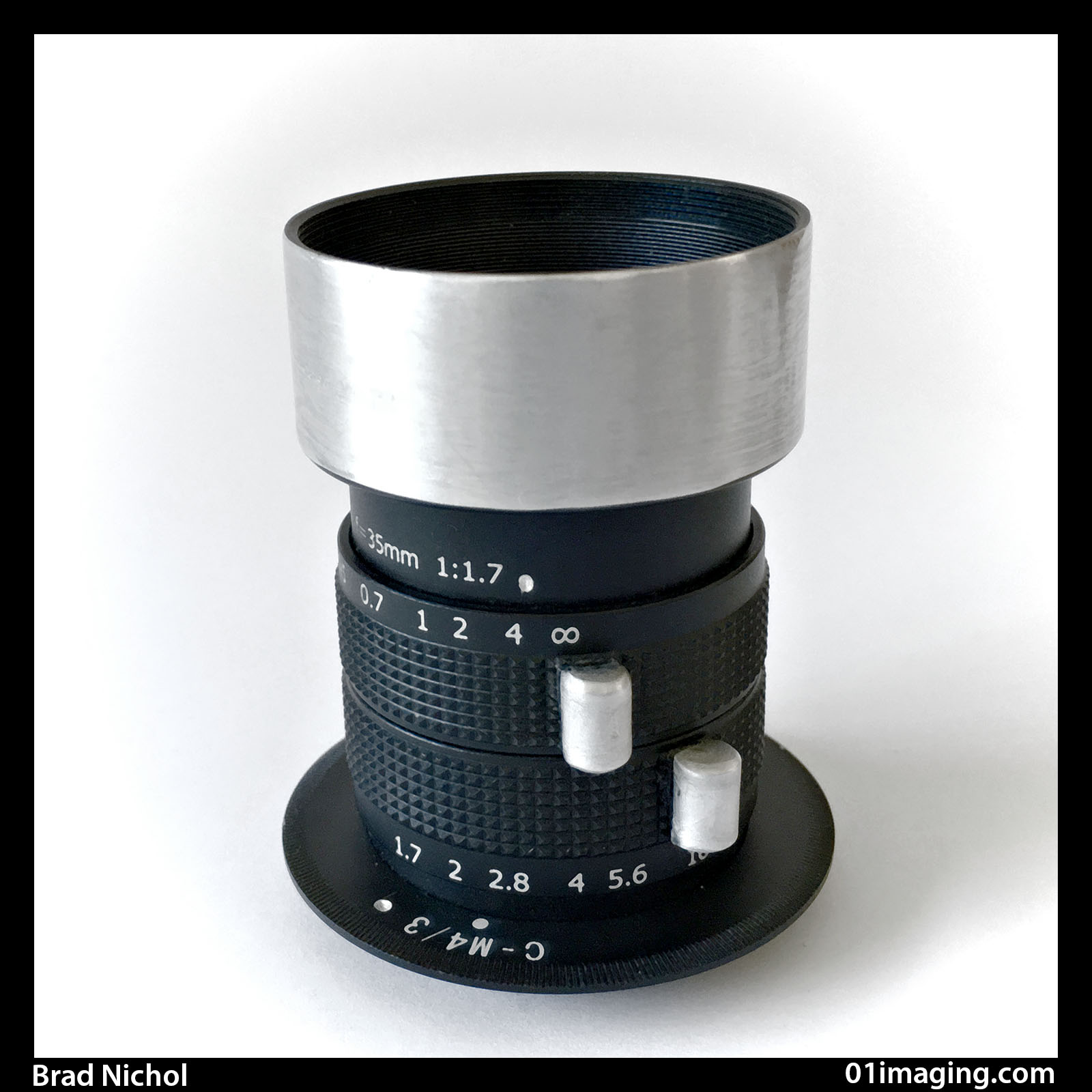
Sure it’s small, but some reviews might lead you to believe it is absolutely tiny, in the scheme of M4/3 lenses it’s about the same weight as several of the obvious fixed focal length M4/3 options, say 17mm f2.8, 45mm f1.8 etc and its most similar in proportions to the 45mm f1.8 Olympus or the 42mm Panasonic equivalent.
Being all metal/glass construction it’s not particularly light for its size but then again at 160 grams with mounting plate, caps and hood attached it is only 8 grams heavier than the Olympus 45mm f1.8 with caps and hood attached, anyway most shooters could pop it in their bag and hardly notice the impediment.
As a further example the rather nice Panasonic 14-42mm f3.5 - 5.6 series 2 zoom, whilst physically much larger (though still small for a zoom), weighs in at 140g with caps and hood.
Build Quality
I know from comments on various forums there can be some sample variance with this lens, mind you that’s not uncommon with any lens, even expensive ones, but my example is tightly built, has a very smooth focus action and the aperture movement whilst just a tad stiff is still rather nice and happily has loosened us with use.
The black paint seems to be evenly applied and has a nice quality to it.
In short there is nothing to complain about for the price of entry and I’ll add that I have used many far more expensive lenses that are nowhere near as well made!
The Odd Little Physical Bits
For $35.00 AU you can’t expect perfection and you will find this lens exhibits a couple of odd little foibles that won’t break the deal but could potentially lead the unaware astray.
First though, there is something super nice about the lens, the aperture, it apparently has 12 blades, Yep you read that right twelve! Those 12 blades do a very good impression of forming a perfect circle as you stop it down, which certainly helps when you’re seeking smooth creamy bokeh, it is only at the smallest aperture that the aperture hole gets a bit ragged, but by then it is a moot point. It is worth noting that earlier versions of this lens appear to have come with a much lower number of aperture blades so be sure to check this out as it's likely there is some older stock floating around out there.
But, and don’t you hate it, there is always a but, the aperture can close right down to nothing, which could be a good thing for video work, but if you get brutal and push too hard once getting to the fully closed down position I fear, in fact I am sure you will be able to distort the aperture blades and permanently damage them. I modded my lens to prevent this happening and we will come back to that later.
Next foible, the lens can focus wayyyyyyyy beyond infinity, that sounds like a cool title for a book or movie “Way Beyond Infinity”, this is somewhat of a nuisance when shooting stills so I modded that too. If I were using the lens only for video I may have left this foible alone and called it a feature as it could serve as useful video effect.
The aperture markings are probably best considered as a guide only, they’re not totally off kilter but certainly not spot on and in any case once you stop down further than f5.6, you have no markings for 8 or 11, it's straight to f16 folks and beyond infinity!
My tests indicate that the marked f16 is actually about f11 or just a tiny bit smaller and I assume from this that the true f8 mark would be much closer to the f16 mark than you might think.
And Now the Odd Optical Bits
To be clear, “odd and optical” can be a cool combination, if this lens didn’t offer some oddities it wouldn’t get lodgings in my camera bag, so just what are the optical oddities?
First up the colour rendition is quite cool, by that I mean cold, not exciting! If you compare an unedited RAW file from this lens to say any other Olympus lens it’s pretty obvious there is a lack of warmth and saturation in the files, is this an issue? Nah, it's easy enough to get any look you want in editing, it just means if you shoot with your camera on say “sunny” WB you will probably find it best to fine tune the in-camera WB rendering by adding a little red/yellow tint. As an aside, at least on my Olympus EM5 mk2, the rendering of blue skies is really nice possessing a richness lacking in other lenses.
Next up, wide open there is very little clarity anywhere in the frame, except in the very middle, stop it down just 1/2 stop and you get a different look altogether. Some folk will no doubt love this wide open fuzzy mush, me, not so much, I like at least a little detail to play with.
That tiny, limited "wide open aperture" circle of clarity disappears completely as the focus distance is extended, in other words at infinity you will be hard pressed to find anything even in the middle of the frame sharp, the reverse being at close up distances the area of clarity expands (assuming depth of field is not an issue), this being the case the wide open setting could prove to be useful for some macro needs. In fact the “circle of clarity” extends to such a degree that once you add a short extension tube to the back of the lens you can almost get a sharp image across about 60% of the frame wide open!
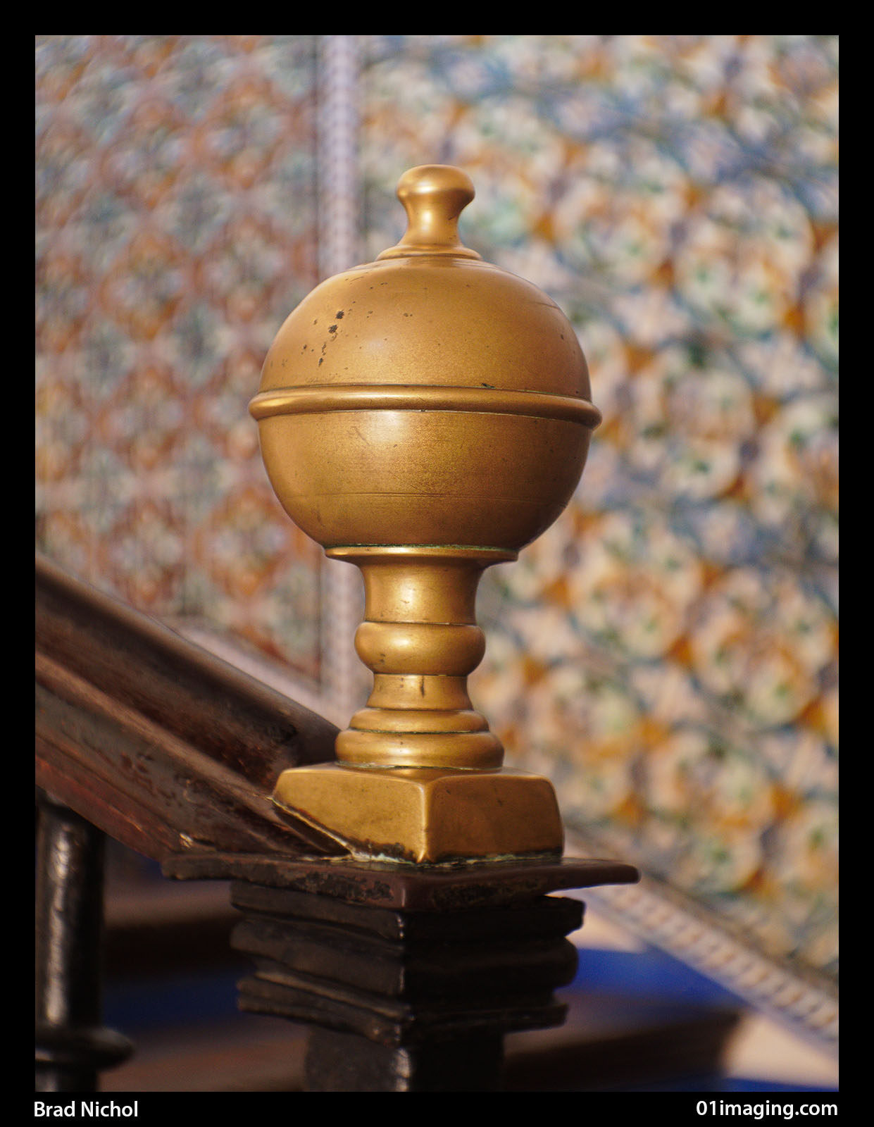
Alcazar Palace Seville, Spain, main stairwell finial, approx f2.8
Bokeh varies considerably with both the aperture (as expected), and the focus distance. With extreme close ups using a macro tube the bokeh is smooth and kinda dreamy, extend the focus distance to the regular close up range without the tube and it becomes swirly and super funky drawing the eye into the middle of the frame, extend the focus to normal distances and it is smooth but with a slight secondary ghosting effect. More than any lens I have ever used this one offers an array of ways to play the visual tune, which I just love, trust me optical perfection is very over-rated attribute.
The plethora of Bokeh rendering options is both a blessing and a curse. A blessing because you can with experimentation probably find a super creative option that matches your image intentions and personal taste, the downside, you could spend a loooong time getting to that result and it can be difficult to reproduce specific looks unless you have made careful mental or even written notes re focused distance, subject shape, aperture and even exposure.
Next up we have flare, and this little baby can flare like a 70s disco unless you use a deep lens hood, keep it away from direct light and make one important modification,(again I will get to that a little later) and the results will be much better.
The flare can be annoying or charming and there are actually two types of flare you will come across, one is the normal flare you get from light sources shining down the length of the lens barrel, the other flare is strong veiling flare where light objects glow a little lowering the contrast and softening things up, the only fix for that is stopping down but for portraits and other romantic style subjects this later type can be a blessing of the first order adding a sweet dreamy quality to your pics.
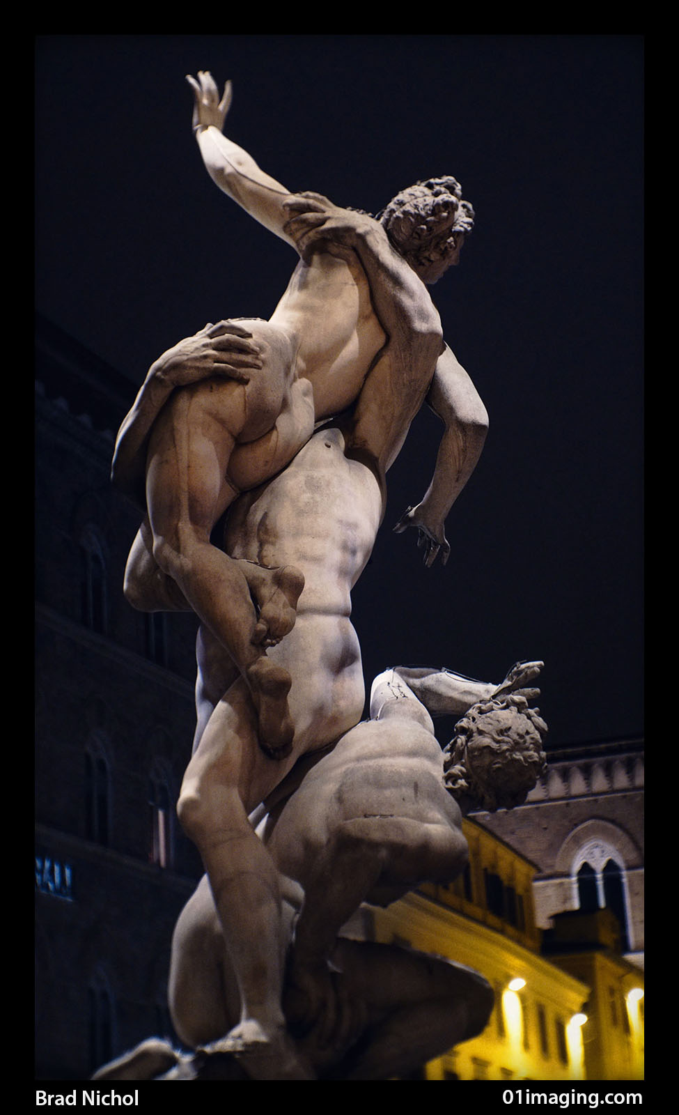
Sculpture in Loggoa Dei Lanzi, Florence Italy, approx f6.3
Generally I found that highlights are almost always recoverable, unless you really throw caution to the wind and seriously overexposure, which interestingly can produce a nice high key result if that’s what you’re seeking. The recoverability leads to renderings that look rather filmic, it’s hard to describe but basically your highlight tones become smoother in gradation and the specular highlights are reduced in intensity.
Shadows can also be recovered, but are nowhere near as responsive as the highlights, being easily greyed up if you're not careful with exposure or the raw conversion process, that being said it’s really easy to simulate cinematic shadow renderings with this lens as the slightly greyed rendering works nicely with selective shadow colour tinting.
Field Curvature
Most lenses these days have close to flat field rendering but the Fujian 35mm is not like most lenses and exhibits significant field curvature. This field curvature is why under normal circumstances you get such massive separation between the in focus and out of focus areas, basically as you move towards the edge of the frame the correct point of focus comes closer to the camera. In practice you can use this to render things in focus towards the edge of the frame that normally wouldn’t be and vice versa, normally however it tends to accentuate the blur as generally with most images the items on the edges and corners of your frame are further from the camera than those in the centre.
I have an article explaining field Curvature and how to use it creatively here on my blog, it may be a good idea to check this out as a companion piece to this review:
https://braddlesphotoblurb.blogspot.com.au
Distortion
I have little to say here, the lens exhibits a bit of pincushion distortion, I have noticed it on occasions when shooting straight edged subjects but generally for the type of images you are likely to be capturing with this lens it’s not going to be an issue.
Resolution
I’ve made it clear earlier that the lens does not resolve sharply across the entire image at normal apertures but in fact central resolution between f4 and say f8 can actually be pretty high, it will never exhibit what you might call high macro contrast but the raw files when properly sharpened show very pleasing levels of detail rendering within that central core.
To get some perspective I ran a little test where I shot this lens at f6.3 and the Panasonic 14-52 mm series 2 kit zoom at the same setting, (confirmed by keeping the shutter speed identical and reading the aperture off on the Panasonic EXIF data). Now consider that the Panasonic is really an excellent kit lens, but when comparing the central portion of the two lenses the Fujian is just a tad sharper, of course that clarity falls off pretty quickly as you move away from the centre of the image but the salient point being in-focus detail rendering is potentially fine.

Robe on display in Museum area of Cathedral de Sevilla, Spain approx f4, it's easy to see the central core exhibits rather good detail capability.
You could always use the Fujian 35mm as an out of the box lens, but for me it was just a bit too annoying and one of the mods I have added I consider absolutely essential for all users.
So here's what I did:
- The mount that is provided with the lens is just a simple screw in C to M4/3 mount, there is nothing to lock the lens in place, this caused two issues, one the markings on the lens ended up on the bottom of the lens when the lens was tightly fitted to the mounting plate and much worse, when turning the aperture or focus ring it was all too easy to end up unscrewing the lens from the mount. To resolve the problem I screwed the lens onto the mount as far as possible whilst still having the focus and aperture markings lined up correctly on the top of the lens and then glued the lens firmly to the mount. The downside being that I cannot use the supplied plastic extension rings with the lens but this is a non-issue as I have a set of m43 extension tubes anyway.

- There is no marking point on the lens to line the aperture ring or focus ring up against so I drilled a two small indents into the mount and the lens barrel and filled the indents with white paint to visually line things up. There are no marking on the lens barrel for apertures between f5.6 and 16 and if I were going to regularly use the lens at smaller apertures I would probably take the time to test the settings and mark the points up.
- I added a physical external stop onto the aperture ring (made of brass) so it could not be forced too far at the closed end and accidentally damage the aperture blades.
- I added a brass infinity stop on the underside of the lens barrel so the lens could not be focused beyond infinity.

- So what was the one essential modification that everyone should do? Well I noticed early on that when I shot subjects with bright areas and especially those with specular highlights I got a circle of flare around the perimeter of the photo. It was easy to see what was causing this, the back of the lens focusing tube was chromed and it was bouncing light backwards and forwards off the cameras sensor, a simple coat of Tamiya matte black model paint killed the issue stone dead.
- I added some little knobs to the focus and aperture rings to make it easier to adjust both using just finger tip pressure, the knobs are made of alloy but I am sure you could use plastic or rubber or anything else that is practical, anyway it does make the lens nicer to use.
- Finally if you didn’t get a lens hood when you bought the lens then you better do so, this baby needs a hood like a meat pie needs tomato sauce. And make it a good deep hood too!
Note: If I were going to use the lens purely for video work I would likely only black the back of the lens focusing tube and leave the other items alone as they could be used creatively for video as indicated later in this article.
Two Tips To Help Get The Most Out Of The Lens
You must centre focus using magnified live view, especially at wider apertures. The field curvature makes it impossible to accurately set the focus if the focus point is anywhere other than in the middle (unless you are shooting at f11 or smaller). The difference between being in focus and out of focus is just a tiny movement of the focus ring once you have moved beyond the near macro distances, the magnified view option on your camera will help you get it just right.
The middle is where all the detail is rendered which generally means you need to frame your photos a bit loose with your subject right in the centre of the frame and then move the cropping box around the image in post to give the final composition that you desire.
Aperture Choice and How It Looks
I will preface the following aperture assessment by saying that most people seem to buy this lens to use it wide open or at least very close to that, this is a shame as the lens can offer many alternative rendering options at smaller apertures which are well worth experimenting with.
- F1.7 is next to useless as far as I am concerned, think of this as an f2 lens and forget about that last part of the aperture range and you will get much better results, trust me there is no gain to be made in terms of bokeh rendering and much to lose by going all the way to f1.7
- F2.4 - 3.5 is very nice for portraits and soft dreamy renderings. Bokeh quality is swirly, especially in close up shots.

Violinist in Piazza del Duomo, Florence, Italy appor f4.5, the very strong field curvature means that despite the aperture used the head of the violin and his wrist is far more focused than you would otherwise expect. The swirly Bokeh is still evident at the aperture than somewhat subdued compared to the results you will see in the f2 to f4 range.
- F3.5 to 5 For general creative work, f3.5-5 seems to be about perfect and even at f5.6 there's still plenty of out of focus blur if you want and it’s nice soft bokeh, still a little swirly on the outer perimeters of the frame, generally this is where I take most of my shots with this lens.
- F8 is great for close ups and out to about 2 metres where you still want the background nicely blurred. Surprisingly you get much more blur than you would normally expect and the bokeh is really quite smooth, it only gets a little busy as you get closer back towards the point of focus. The central 50 % of the image is nicely sharp and this could be a good choice for portraits where there is nothing detailed in the frame right behind your subject, which I realise sounds odd but trust me it works.
- F11 will give you cross frame clarity that would cover the equivalent of approximately the area of a 1inch sensor. Actually pretty useful for close up shots of plants and flowers food and much better than you might expect. At this aperture you can start to focus a little off centre if you need to.
- Between f11 and f16 is where you will obtain the largest area of central detail without wavering into contrast reducing diffraction if that is what you need, once of course you have properly sharpened the raw file with very low radius/high percentage sharpening to compensate for the mild diffraction.
- F16 (indicated) will almost give clarity across the whole m4/3 sensor area and is fine for fully resolved square images. If you had the lens on your camera to do all the creative things on offer and quickly needed a more regular shot of something you could probably get away with this aperture instead of changing out to a normal lens, it's not ideal but with a little cropping much better than you might expect.
- F18 (approx, it’s not marked at all) will give total cross frame clarity on the m43 sensor, now you might think this would be a useless diffraction ridden pile of optical stink but I have used this option quite a bit and when combined with appropriate RAW file editing it gives a rather lovely long tonal range rendering which looks very analogue, check out the pics in the article to see what I mean.

Cattedrale di Santa Maria del Fiore, Florence Italy, shot at approx f18 shows overall image clarity and smooth tonality in this monochrome rendering.
Chromatic Aberration
We have a real mixed bag here, and to get the most out of the lens you will need to roll up your sleeves and make yourself familiar with the CA correction options in your RAW convertor.
First of all, you are not going to be able to fix the CA using canned profiles, the lens does not transmit any information to the camera so there's no lens information available to base the corrections on. Additionally the correction process is a little more complex than with most lenses as the CA is very tightly aperture dependent.
At wide aperture apertures CA is a non-issue, it's there but the lack of edge and corner definition means you are very unlikely to notice it, but as the aperture is closed down the CA becomes increasingly evident and it requires quite different adjustments for each aperture and even between apertures.
It is well worth fixing the CA as it radically changes the look of the image, making it look much sharper at small apertures, it also noticeably improves the colour rendering on the edges and corners of the frame.
At middling apertures CA mainly requires yellow/blue adjsutment but as the aperture gets smaller red/cyan adjustments also have an effect and by f18 it is almost entirely an issue of the red/cyan adjustment.

Test shots taken at approx f22 demonstrates overall clarity and the ability to control highlight tonality in high contrast lighting, it really is sharp out into the corners and this is not a cropped frame, the image below is taken under the same settings and further demonstrates the lenses stopped down ability. Note that chromatic aberration and minor vignetting have both been corrected in these files.

Channel Differences
Most lenses fail to render and even degree a clarity across the three colour channels, but generally they are reasonably close, not so with this lens. The red and green channels resolving quite closely and allowing for the fact that the red channel is derived from only half the pixels used to build the green channel I would say it is probably a draw.
The blue channel however lacks resolution across the board, as the aperture closes down both the red and green channels quickly improve, the blue barely budges. I know from years of tinkering with all sorts of lenses that this behaviour can provide for a nice image rendering that suits portraits in particular but for sharp general shots it's not a helpful characteristic.
The good news is that if you wish to convert the images into a monochrome, a 50/50 mix of the red and green channels will give a final image that looks sharper and generally more detailed than the original full colour shot, with this lens the difference is just more extreme than you would normally encounter. I rather like the way this lens renders in monochrome, they get a sort of old world medium format look which is hard to define but quite attractive.
Where Is This Lens Useful?
A) For a unique depth of field rendering on otherwise flat field objects which benefit from the field curvature and soft edge definition. For example I used this lens on our recent European trip to take photos of carvings and statues on the walls of churches and give some separation from the surrounding stone work, a trick that is impossible with a regular flat field lens.
B) The lens is terrific for portraits, you can get the background well out of focus and easily give a softer rendering of skin texture, all the ladies I have shot with this lens have made much the same comment when seeing the pics, " I love that, you can’t see the wrinkles so much”.
C) It is perfect for dreamy landscapes in the fog, I really can’t think of anything better suited.
D) A great choice for macro and close range shots where you want serious separation of the subject from the background.
E) Where you want an "old world" monochrome look, say something akin to a “box brownie style” rendering of buildings and landscapes.
F) Ideal for video work where you want something a bit different from the highly resolved, high contrast rendering offered by most modern lenses.
G) A nice option for to help images read well on the web, the accentuated blur strongly directs the eye towards the frame centre which is helpful when dealing with smaller low res on-line images where the overall look trumps fine detail rendering.
G) Finally the lens works well with built in film mode simulations.

My wife Wendy taking some moments out in Piazza del Duomo, Florence, Italy approx f3.2

Locks attached to the Ponte Vecchio, Italy, approx f3.2, focused in centre and crop moved to suit.

Detail above door Cattedrale di Santa Maria del Fiore, Florence Italy, cleary shows the ability of the lens to render relatively flat field objects in a more three dimensional way,
approx f4.5
Video
This is potentially a brilliant lens for video, in fact I envisage that you could shoot a whole video with it using the obvious deficiencies as creative options, just think of the possibilities:
A) With the aperture able to closed down fully you can fade from black to regular exposure or the reverse whilst shooting.
B) The lack of clarity at the wide open setting means you can move from unfocused to focused purely by adjusting the aperture and leaving the camera in auto ISO, this will give a look quite different to pulling focus.
C) You can isolate subjects in ways not possible with regular lenses, even having the camera pan across the scene with the central area remaining in focus as the camera moves across the image field.
D) Easily create “glowing flare” by removing the hood and shining lighting towards the camera out of frame.
I am sure there is much more you could do, my main point is that in this cheap little package we have an enormously powerful and creative tool that well exceeds its tiny monetary value.
There is of course nothing to stop you modifying the lens to make it more suited to video with focus levers, moveable stops etc and even if you messed up it’s not much dosh to lose in the process.

Violinist in a dark alleyway, Venice, Italy approx f5.6
To Sum Up
So in summary what can be said, first it really is ridiculously cheap, so long as you know where the limits lie and you need its rendering characteristics for creative purposes, however if you merely want a general purpose fixed focal length lens then look elsewhere, this one would then prove to be very poor value indeed.
Really the Fujian 35mm f1.7 is a specialist tool for specialist needs, it truly opens up a vast array of photographic options, for the money there is no real reason why any half adventurous M43 user shouldn't have one in their kit.
I will finish by saying I am so impressed with the little lens, I intend to buy another couple and modify them accordingly for specific needs!