When was the last time you saw a round photo, it's probably been a while, the world is ruled by squares and rectangles. It's almost as if there's no place for circles but I have come round to thinking that maybe those ancient mathematicians were onto something when they got all excited by circles, perhaps you can have your pi and eat it too.
There are times when a circle can be just beautiful as a framing element, where it acts as a perfect compositional accompaniment, times where the lack of straight lines and corners liberate the contained subject.
As an architectural element, the circle is not exactly in the big time, you don't see many round windows, buildings, or rooms, that makes sense, rectangles and squares are just far more efficient, but curves and circles can be very beautiful architectural forms, the Pantheon in Rome is one pretty mazing example of the circular architectural option. But turn your attention to nature, here we find an abundance of circles and curved forms, our earth, the sun, seeds, water drops and even our own irises, the circle or subtle versions of it are a dominant form.
Nature made curves and circles and man made straight lines to tame what nature did.
I don’t think there is anything particularly radical about the circle, but it certainly seems to have be somewhat ignored as a framing element, I find that a bit odd, or perhaps it's me that's odd?
If you want to get an idea of how neglected the circle is, just do a search "on-line" for circular frames, pretty much all you will turn up are bulky over-decorated monstrosities that draw attention to themselves or “kitsch ticky tacky” that seems to be destined to serve as a border for needlework. (and no I am not knocking needlework) The circle just doesn't seem to be taken all that seriously in the art world.
You may be surprised to learn there have been cameras which shot in circular format, and no, I don't mean fish eye lenses, I mean actual cameras shooting actual circular frames.
Remember the first Kodak Brownie, probably not, but that first box brownie, the one that took the world by storm, mobilised an army of snap-shooters, the camera line that brought photography to the great unwashed photographic masses originally shot in circles!
The reasons were not necessarily due to image aesthetics, but more because the original lenses fitted were very simple and hopelessly soft on the edges of the image field, going circular chopped off the worst of the problem. The circular format also meant the camera did not have to be held in a horizontal plane to take a portrait, everything was shot holding the camera vertical, a good thing as the original Brownie had no viewfinder and was intended to be held a waist level, later models added viewfinders which worked in both the vertical and horizontal planes.
If you've never seen a print from one of those early brownies and chances are you haven’t, they have a neat image circle in the middle of what would have been a nice white paper background. These days any of those originals will now have yellowed borders with all manner of marks over the surface. The photos themselves are soft and quite dark towards the edge of the circular frame, all have low mid-tone contrast and generally they lack clarity. Or you could just say they look, ah, "endearing", in any case they would have been a revelation to the general public at the time.
Well I am not here to tell you how to create a "faux circular brownie shots", there is probably an iPhone app for that, but rather to discuss the merits of the circular format and make some suggestions on what type of images actually work well in such a format, or perhaps get you thinking about how you may compose for the circle.
Thoughts on the Circle
In the mechanical world circles are strong, aside from making a great wheel, a semi-circle makes a perfect arch support for heavy structures, and as a compositional frame the circle is also strong, it draws the eye towards the middle of the frame and concentrates your attention.
Far more than the rectangle or square, a circle suggests security and finite limits, yet despite the strength of the circle it can also offer a look that is soft, organic and inviting and it always makes a definite statement about the contained image.
Squares and rectangles contain an image and suggest boundaries but we all know instinctively there is more beyond the boundary, but the circle seems to say, no this is it, forget about what is beyond, look to the subject!
A circle offers a different path to composition, a path where curves in the scene work well but straight lines can tend to be at odds with the border. The circle represents a framing that in many ways is far closer to how we actually see the world, not quite of course, as we see the world as a sort of oval with darkened and less saturated outer edges, but a circle is much closer to our vision than a rectangle ever was!
I feel the circle is a very powerful compositional tool, but do a web search, see how much you can get Mr Google to find for you on the subject, very little I will hazard a guess, the poor circle seems to have been lost in the mists of time and is now seen rolling around inside rectangular and square boxes.
I would like to balance the books, so here are a few ideas, my ideas, they may help. I don’t claim to be an expert on composition in the “learned art” way, (well I did minor in art at Teachers College but frankly I can’t recall us ever talking much about circles as compositional boundaries), but I've found the following ideas work for me visually and perhaps they will for you.
Not Radial
When most people think of circles and composition they immediately think about radial compositions, like spokes in a wheel, looking down circular stairwells, sea shells and such like. Perhaps counterintuitively I think most of those subjects probably look better framed and composed in square or slightly rectangular formats which seems to accentuate the compositions via the strong contrast provided by the square frame edges.
You can certainly frame radial subjects with circles but I'm not dealing with examples of that here. Anyhow here is my take on going around in circles.....
Break It Up
First up I think circular framed areas need to be broken up to work well, there needs to be some definite and clearly obvious compositional intent or theme. Of course so do square and rectangles framed areas but in the case of the circle I feel your efforts need to re-doubled because the circle will draw strong attention to any compositional deficits.
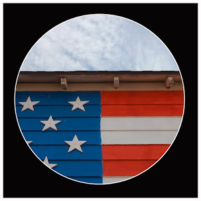
The Patriot House
Here the circle is broken up in a very obvious way, there are three primary areas but the red and white stripes on the right hand side also add extra areas, normally the breaks would be less defined but when you think about this concept it's possible to see how many straight edged compositions could be framed within a circle by moving the circle around over the composition until the elements start to sing together.
Rule Of Thirds
We have all used the rule of thirds for rectangles and squares, we can apply the same concept for circles, except the intersection of the thirds becomes not a point where the main subject is necessarily placed but a point where the other main compositional elements radiate to and from. This can provide the composition with a strong sense of depth.
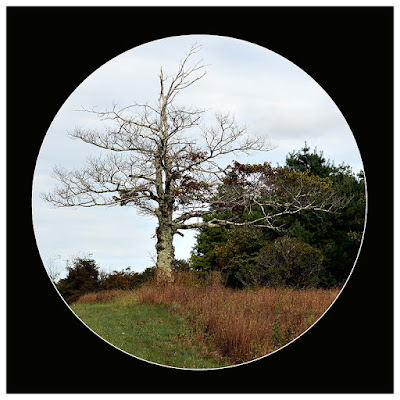
Blue Ridge Tree
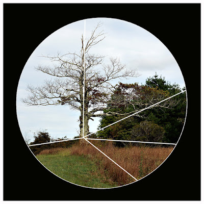
Here we see the shot with and without the compositional lines, it's quite obviously a version of the "rule of thirds", the radiating point is roughly one third of the way across the diameter of the frame and one third up from the closest point on the perimeter of the image. Being a circle those inferred radiating lines act to draw the eye into the point where the lines meet, in effect (when seen on a reasonable scale) increasing the sense of 3D.
Echo the Circle
Taking things further circles being curved tend to work well with elements that have curved shapes in them, in other words shapes that echo the frame itself, which is quite different to squares and rectangles. Subjects that show surface curvature seem to look more 3D to my eyes when placed inside a circular frame.
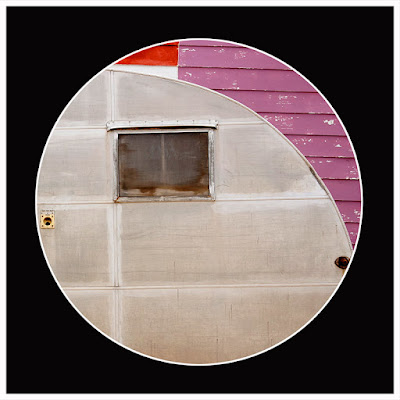
Route 66 Van
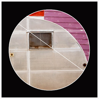
Here, the echo of the circle is strong, but curved compositional elements can be combined with the rule of thirds and even the concept of frame break up, as I have tried to do in the case. It would have been ever better if I had been able to include the top of the wheel arch but alas, doing so messed with the framing of other elements in the image.
Whilst on this image, I always tell my students, less is more when it comes to composition, it makes the image easier to read and this shot I feel demonstrates that quite well, it is a simple direct image that has instant impact. So circles or rectangles, good advice is always to try and simplify!
Stick with Curves or Straights
I feel that generally compositions where all lines are either curved or straight tend to work better than those that combine the two, but as in the above shot there are exceptions.
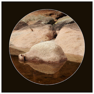
Freycenette Rockpool
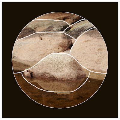
This image has almost no straight lines, it is dominated by curves, which are also repeating. The use of dominant curves facilitates an organic soft impression, even when we know the surfaces involved are hard or maybe man made, we can easily see this in architecture where large scale curved form buildings look far more organic and less imposing than their square edged equivalents.
Going Straight
There is a place for symmetry and straight lines, but unlike with a square or rectangle frame a circular framed composition where the all lines are straight has to be very finely balanced to work. In the example below I have taken four frames shot at the CSIRO building in Canberra Australia, it's pretty obvious that the two right hand examples work better than the left hand images, The reason? Both of the right hand examples are far closer to "using radiating lines from a rule of thirds origin point" than the left side images are. None of these images were ever intended to be expressed in circular form and finding the right framing "in post" was frustrating to say the least but to my eye the bottom right one is the most successful.
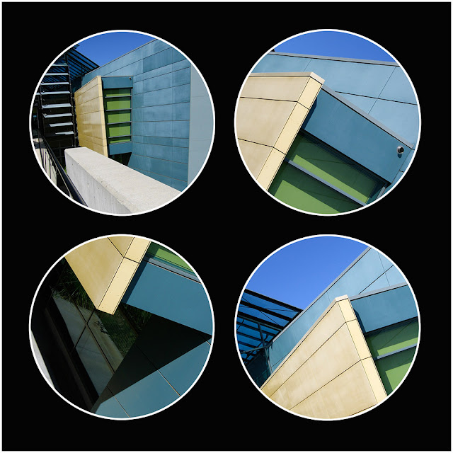
CSIRO Angles
Leading Lines
Just as with regular rectangular and square framed images, circular images will gain a strong sense of 3D by using leading lines which flow through the image or into the core radiating point of the image. In this case the water literaly flows right through the image, neatly dissecting the composition adding a sense of natural symmetry, combined with rocks which are all rounded and we get a composition that feels nice and organic yet kind of structured at the same time.
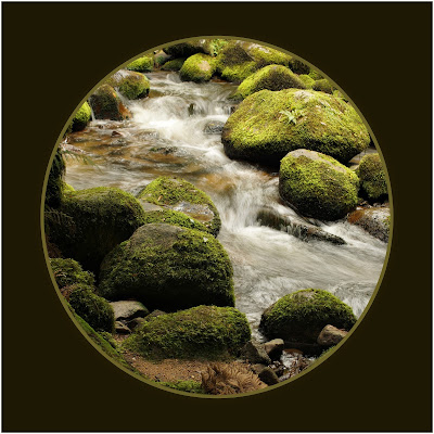
Babbling Stream
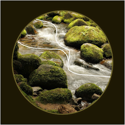
Leading lines can of course be very obvious and the lines do not need to lead to a origin point inside the image but may also lead to an imaginary one outside the frame, this seems to work particularly well with images framed within circles, such as the one below.
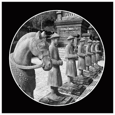
Stone Soldiers
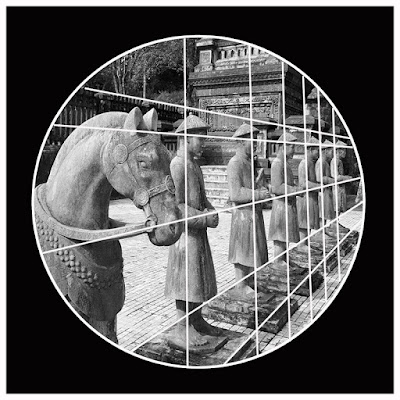
The "Stone Soldiers" image not only uses the concept of leading lines but combines that with repetition which is further emphasised by the reducing distance between the repeating elements. The result, an images with an extreme sense of 3D. I can absolutely vouch that this image is far stronger in a circular form than it is in a rectangular or square form where the additional negative space around the subjects and the straight surrounding frame soften the overall 3D effect.
Think in Layers
For a strong sense of depth in an image where you do not have clear leading lines, take a different compositional approach, think in terms of layers. In its simplest form this means having something near and something distant in the frame, using a wide angle lens as was done here, will help you to accentuate such near/distant relationships.
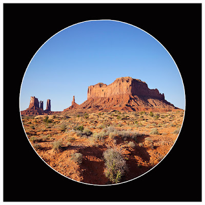
Outside Monument Valley
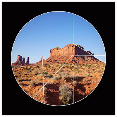
The use of layers can be far more developed than the above example, we can have several layers that allow us the appreciate the image at different depths, almost as if we had several different stories or compositions within the one frame.
"Roadkill Cafe" below uses this approach and the individual scenes are broken up by lines which frame each layer. The near layer of the tow truck is quite close to the camera and the wheel in the bottom right side act as a sort of counter point to the whole circular frame. Next we have the machine in the closer middle distance, the cafe in the distance and there are other elements in the far distance in the right hand top frame, but all frames do contain individually elements that are "near and far", so the depth can be read in each section of the frame. The circlular frame just amplifies the whole effect.
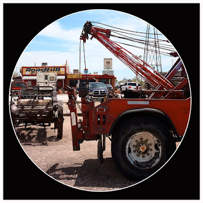
Roadkill Cafe

Appreciate the Triangle
In this final example, we have compositional layers being used again but combined with lines both inferred and actual that join the elements together and break the circle into definite areas, all core lines radiate from two locations. This composition is predominantly made up of triangles, I have outlined the core ones, but if you look closely I'm sure you will find many other smaller triangles.
I mention triangles because there is something strangely beautiful about the use of triangles within circular frames, they just seem to naturally facilitate a very strong composition, of course this combination has strong mathematical origins but lets just appreciate it for what it looks like.

Boat Traders

Wrapping Up
In most ways composing within the circular frame is very much the same as using a square or rectangular one, the concepts are similar, you just appreciate that the circle is more demanding on your compositional skills. When done right the circular frame can help you produce a final result that is very powerful, has a strong sense of 3D and is more expressive. But note this, the circle acts likes a bullseye, it says "Hey, Look Here" so just make sure that when the viewer does look there is actually something to see!
There is much more to look at in relation to the use of circles but I'm confident that if you start with the ideas I have expressed here you'll make a great start to breaking out of the box.
Hope it helped
Braddles

nice post
ReplyDelete